Maidworth Holdings Brand Identity
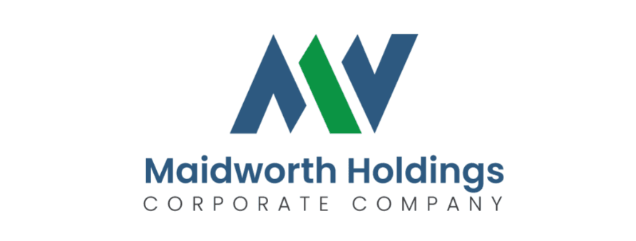
The identity centers on a minimalist monogram that seamlessly integrates the letters "M" and "W." By using a shared central stroke, the logo symbolizes efficiency and interconnectedness. The typography is a clean, sans-serif font that provides a balanced foundation, while the secondary "Corporate Company" tagline adds a layer of established professionalism.
The Challenge
As a holding company, Maidworth needed a visual identity that felt "umbrella-like"—strong enough to stand alone, yet versatile enough to represent diverse business interests. The challenge was to avoid a "busy" look while incorporating two wide characters ("M" and "W") into a compact mark.
Our Approach
I moved away from traditional, bulky block letters in favor of a slant-edge geometric approach. By interlocking the strokes and using a dual-color palette (Deep Slate Blue and Emerald Green), I created a visual "upward trend" within the monogram. The green segment acts as a focal point, symbolizing growth and renewal amidst the blue’s stability.
The Outcome
The final brand mark is highly architectural and conveys a sense of "building" and "holding." It looks equally prestigious on a corporate letterhead as it does on digital platforms, effectively positioning Maidworth Holdings as a reliable and forward-thinking entity.
Need something similar?
Let's discuss how we can bring your next idea to life with the same level of care.