BluePrint - Brand Identity
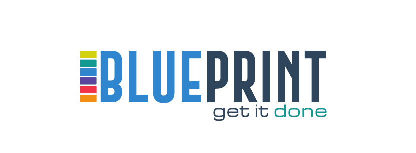
The identity features a bold, sans-serif logotype accompanied by a "stack" icon. This icon, composed of multi-colored horizontal blocks, represents the various layers and stages of a project coming together. The transition from a bright sky blue to a deep slate grey in the typography emphasizes the journey from a "vision" to a "solid reality," anchored by the actionable tagline: "get it done."
The Challenge
The word "blueprint" often carries a technical, somewhat "cold" connotation associated with construction or industrial drafting. The challenge was to modernize this concept to make it feel accessible, creative, and applicable to a wide range of services—from project management to digital strategy.
Our Approach
I introduced a spectrum-based icon to the left of the text. Each color block signifies a different department, step, or skill set, suggesting that "BLUEPRINT" is the unifying force that organizes these diverse elements. By using a rounded, modern font for the tagline, I softened the corporate feel of the main title, making the brand feel approachable and high-speed.
The Outcome
The final design is highly recognizable due to its unique color stack. It successfully positions the brand as an all-in-one solution provider. The visual hierarchy ensures that the name is the first thing seen, while the "get it done" tagline leaves a lasting impression of reliability and efficiency.
Need something similar?
Let's discuss how we can bring your next idea to life with the same level of care.